An Identity Worthy of Scale
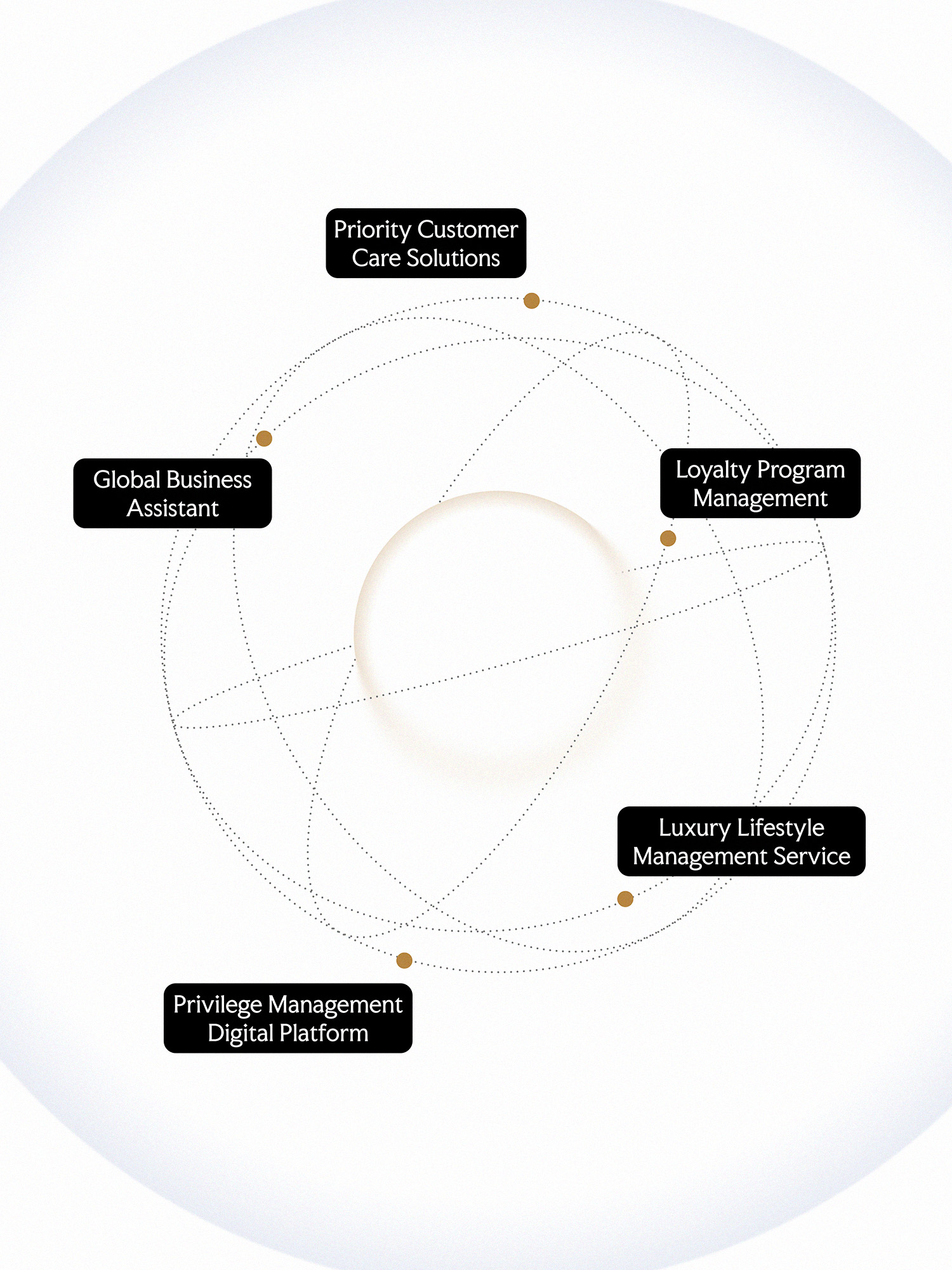
LinkCare is a consultancy that develops and manages premium customer care programs for banks, financial institutions, and major businesses. After 15 years in operation, the company has built a network of more than 2,500 partners and served 4 million customers.
Behind that scale sits a complex operating model: privilege program management, a service partner network, and 24/7 customer support. The previous identity undersold that operation. It did not signal the precision a bank expects before handing its most valuable customers to a partner. The brief was functional: make LinkCare’s operating capability and service standards visible at every B2B touchpoint..
Connections That Define LinkCare
Favor started from one principle: trust should be the first thing people see. The identity is built around the three relationships LinkCare manages: corporate partners, service networks, and priority customers.
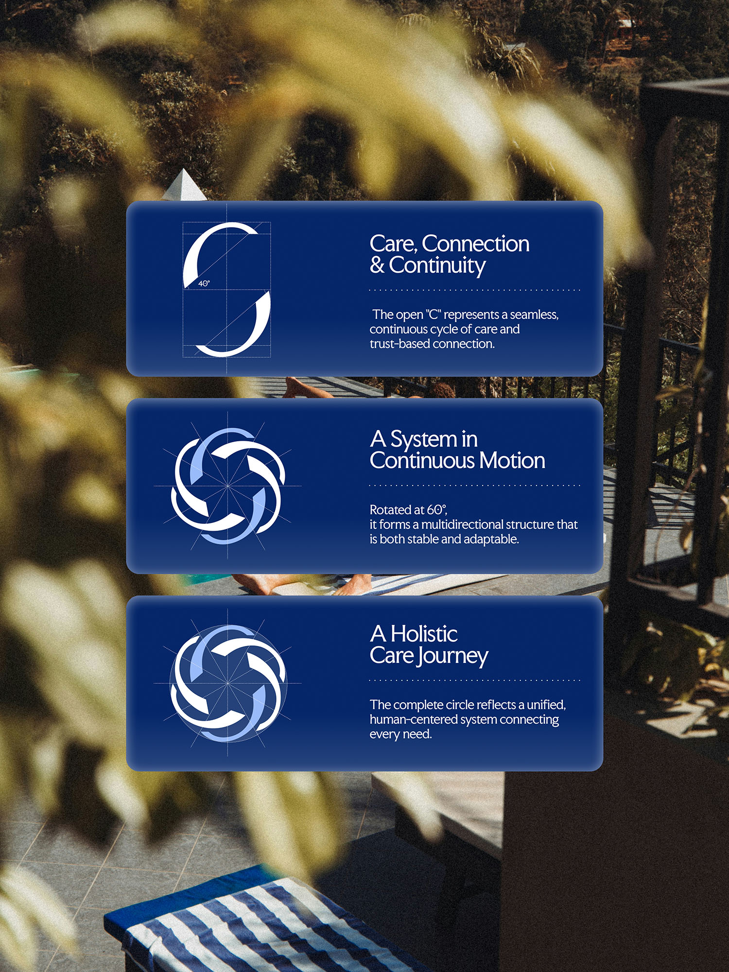
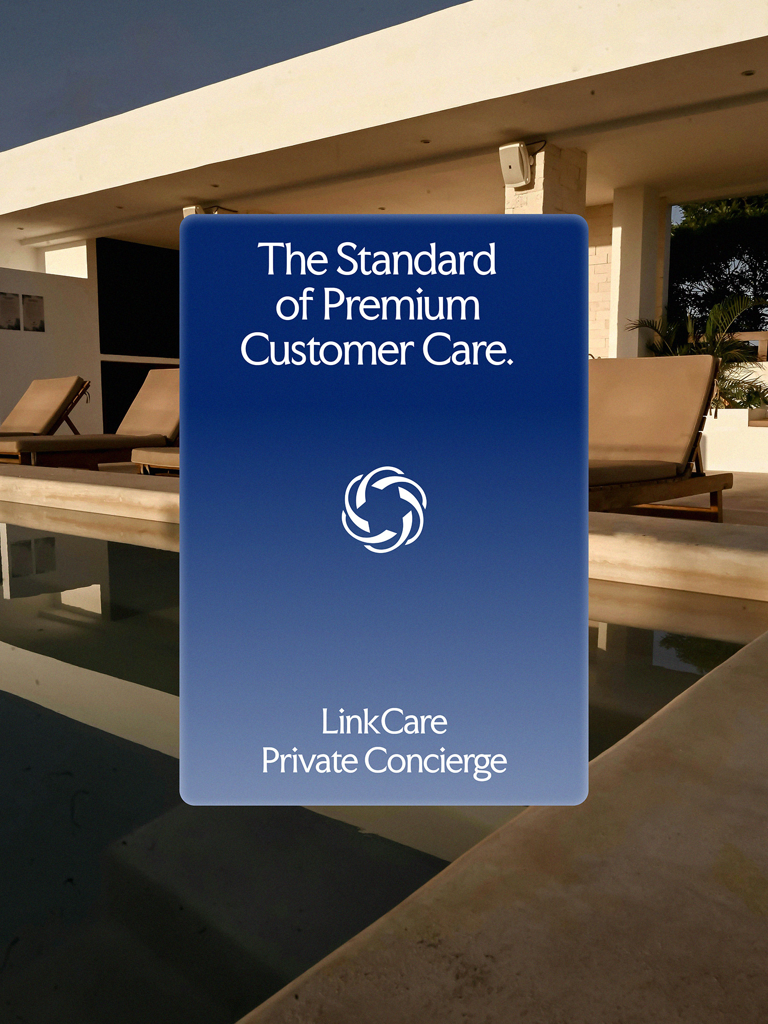
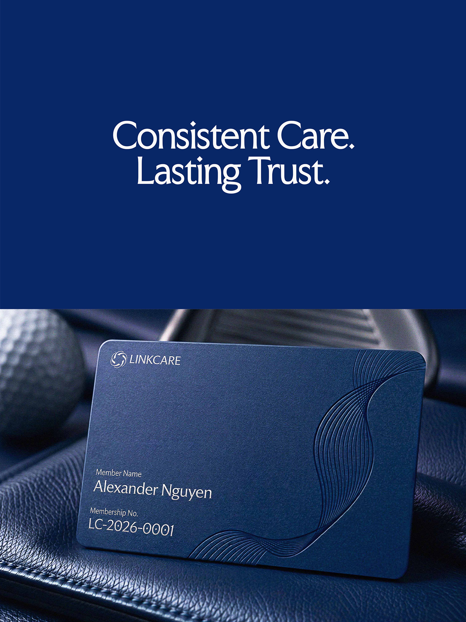
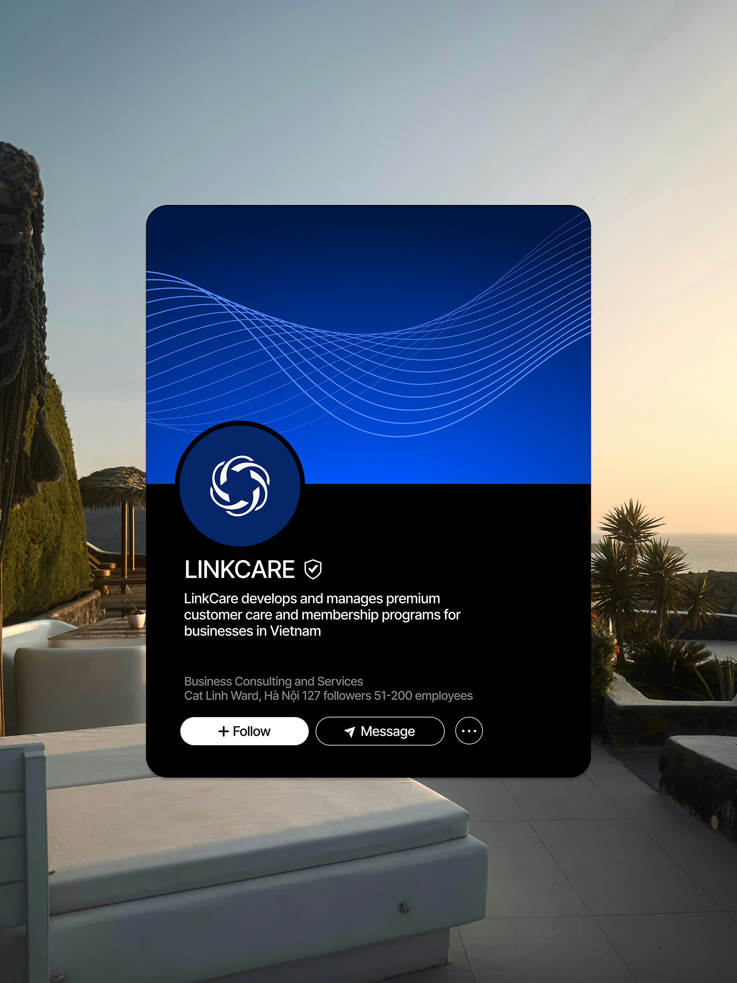
At the center of the system is an interlocking spiral logo, forming a kaleidoscope inspired by the continuous connection between touchpoints. From this mark, flowing curves were developed into a graphic language of steady, connected movement that mirrors a well-run service operation.
Standards in Every Detail
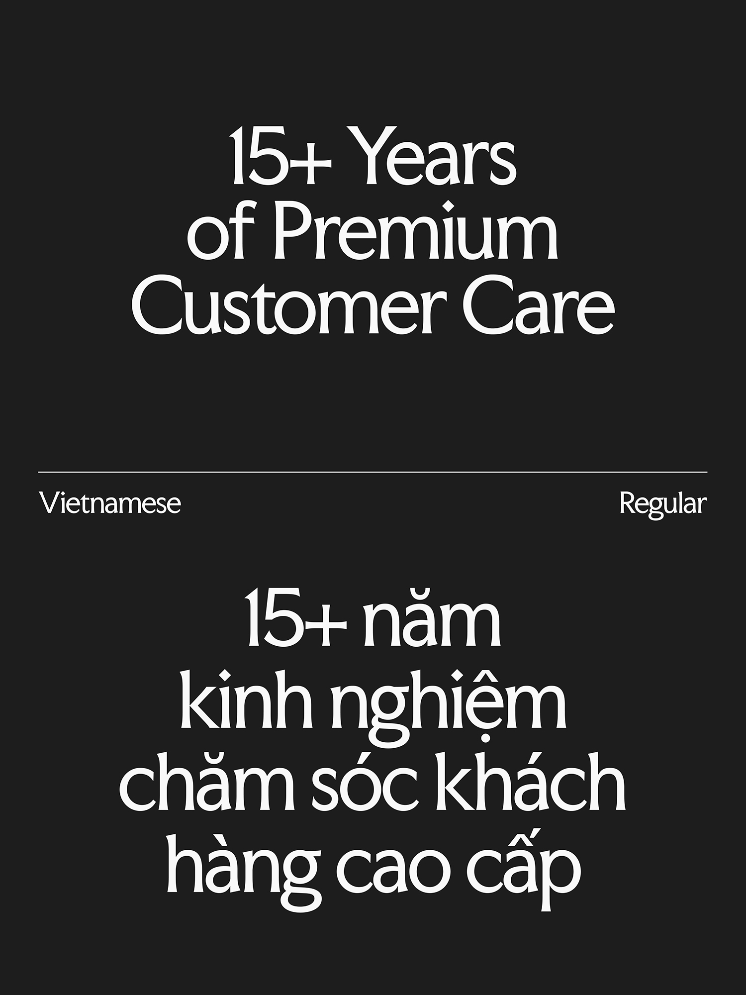
The typeface starts from Faculty Glyphic, refined by Favor for Vietnamese diacritics so both languages are set with the same weight and rhythm. Paired with the curve system, it gives the brand a grounded structure that reads as disciplined and dependable.
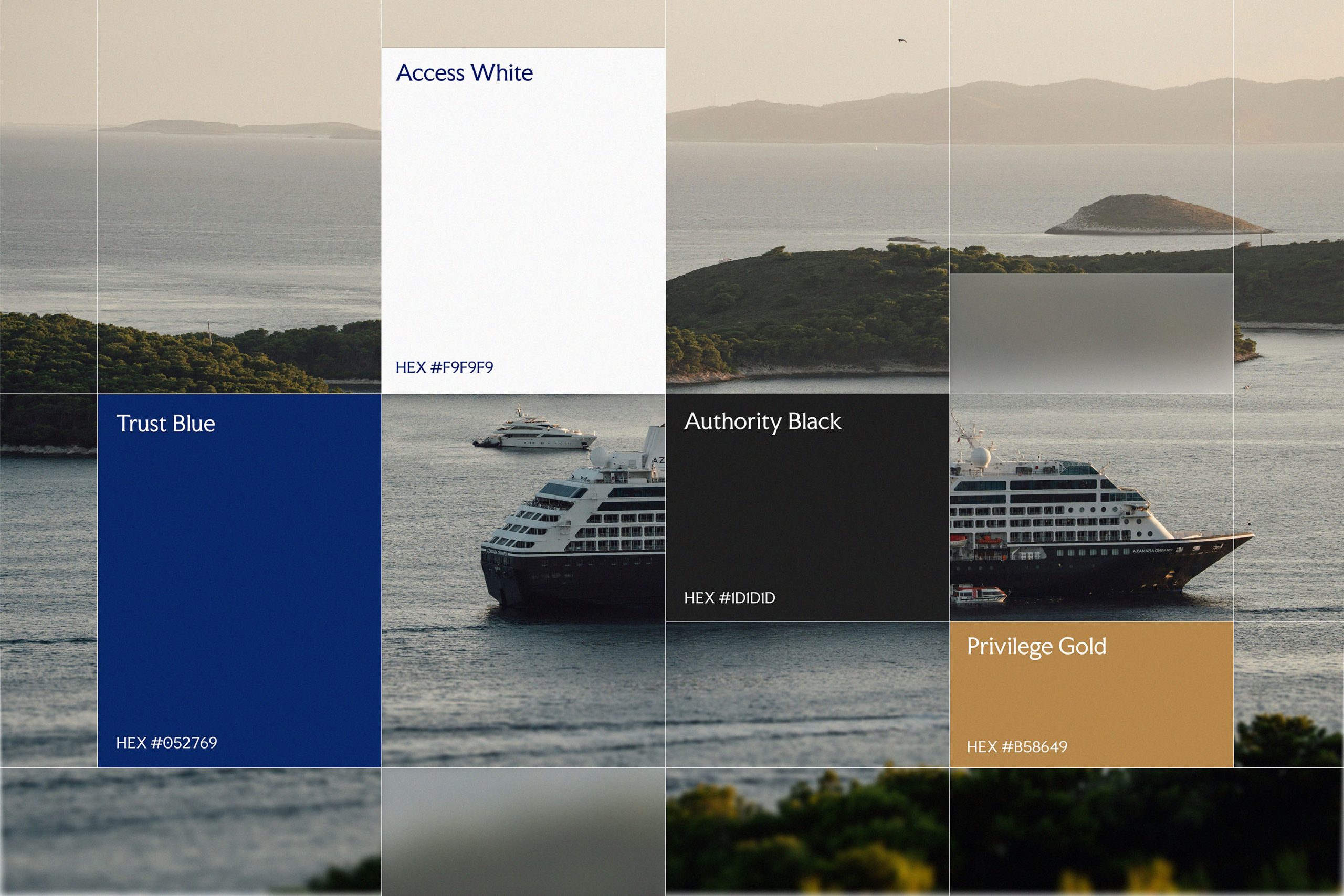
The color palette is organized around clear functional roles. Trust Blue carries reassurance, while Access White brings clarity, transparency, and approachability. Authority Black and Privilege Gold act as key accents, introducing depth and signaling premium service tiers across the identity. Together, the palette gives LinkCare a stable yet open presence suited to a strategic partner serving large corporations.
Bringing the Identity to Every Touchpoint
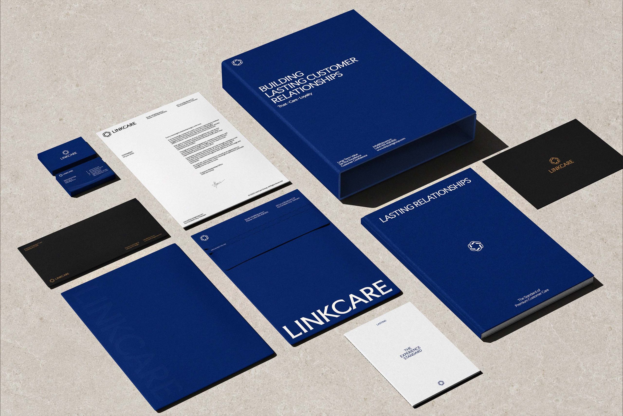
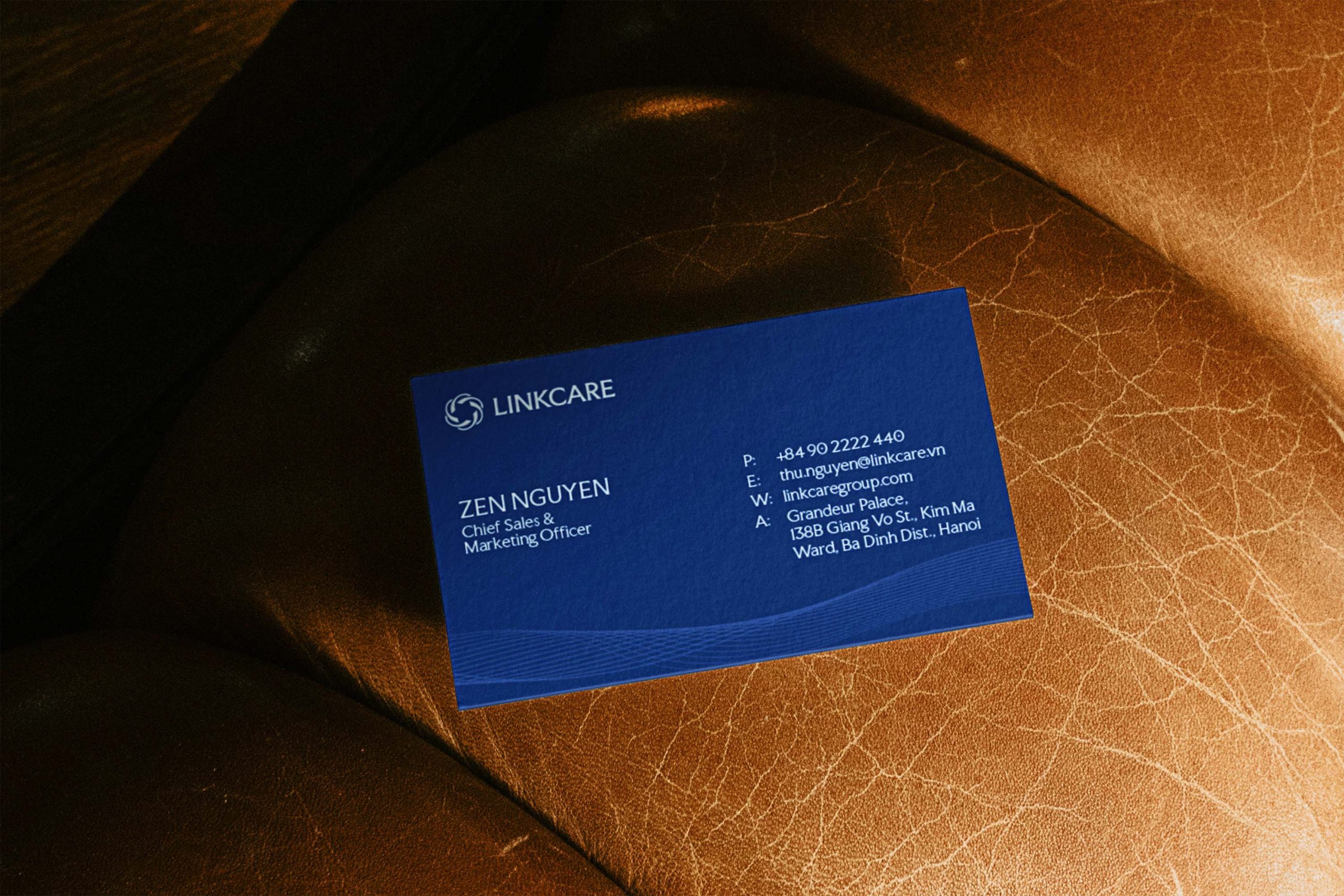
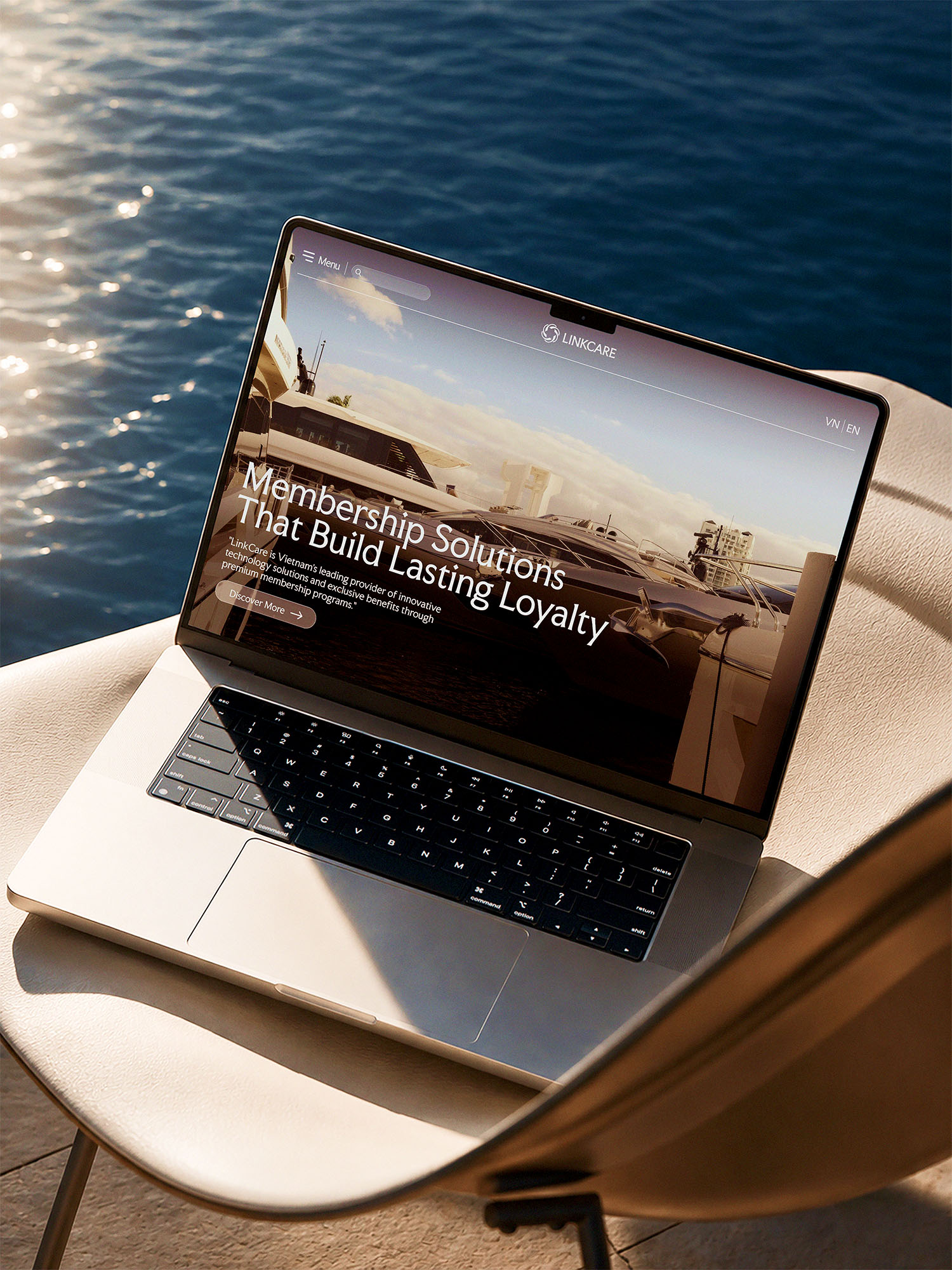
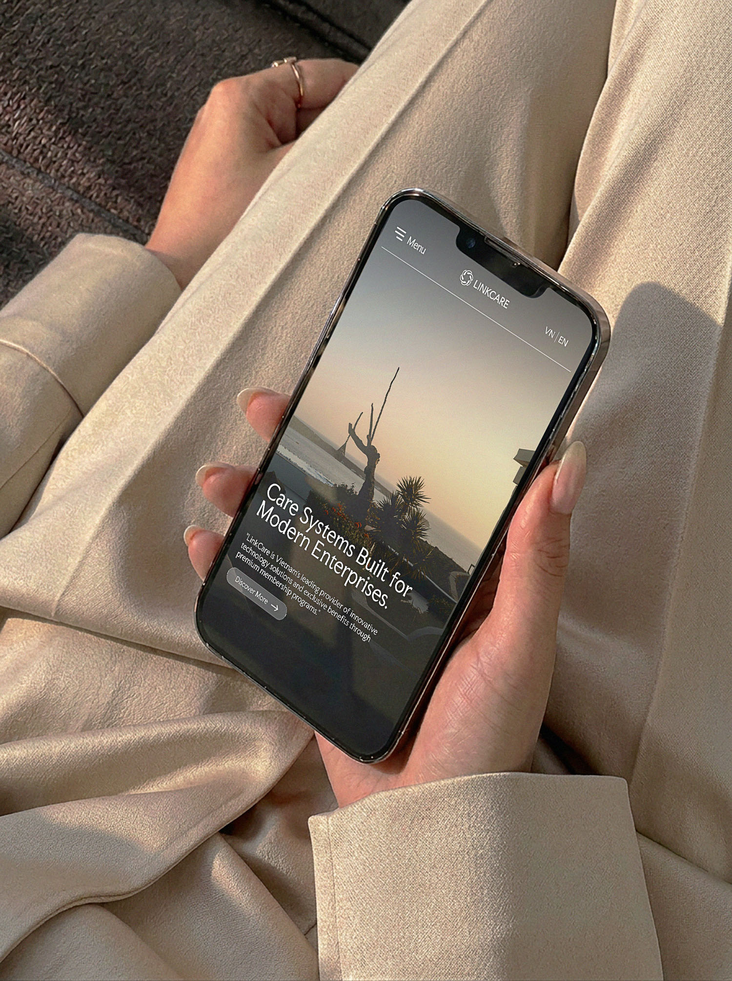
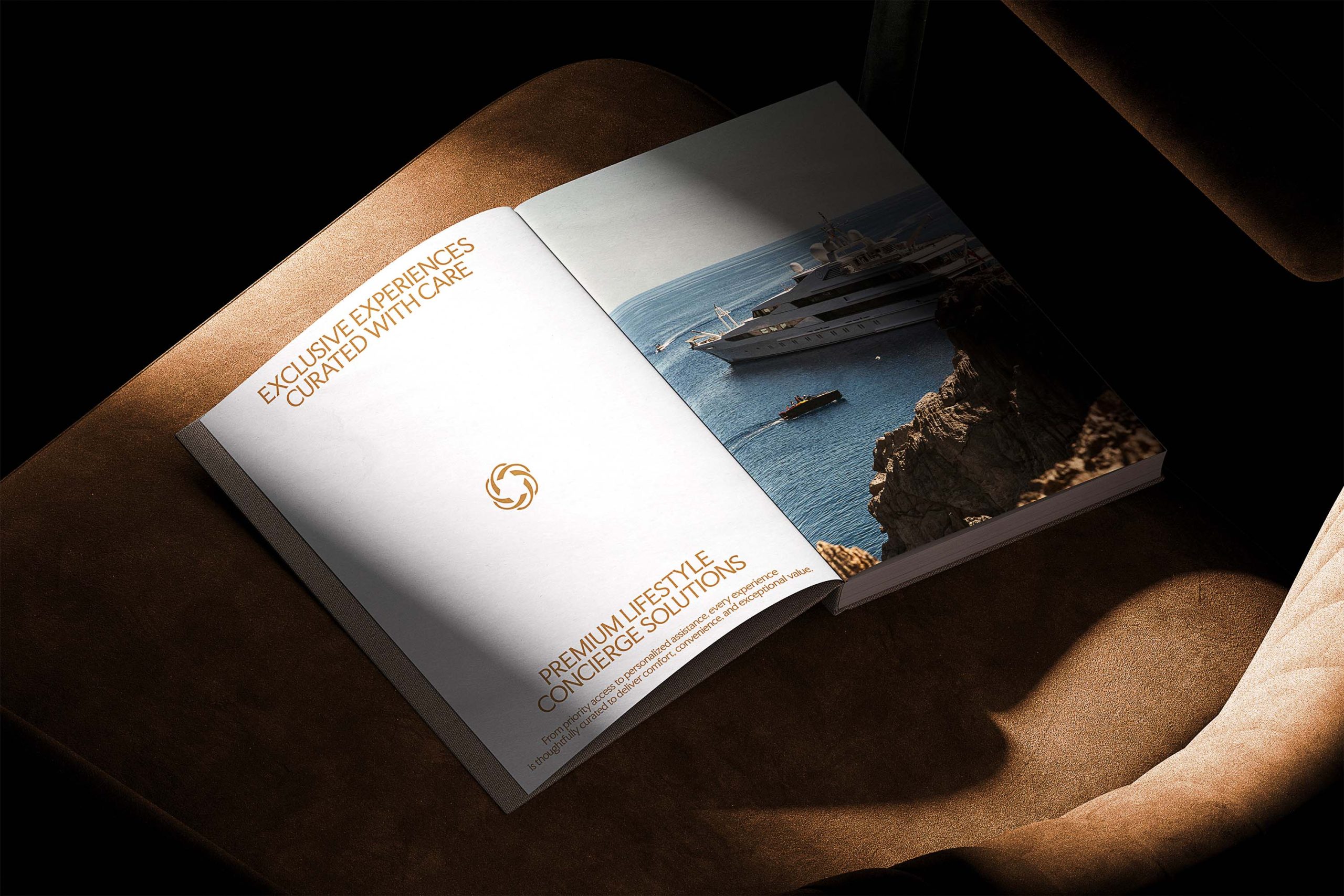
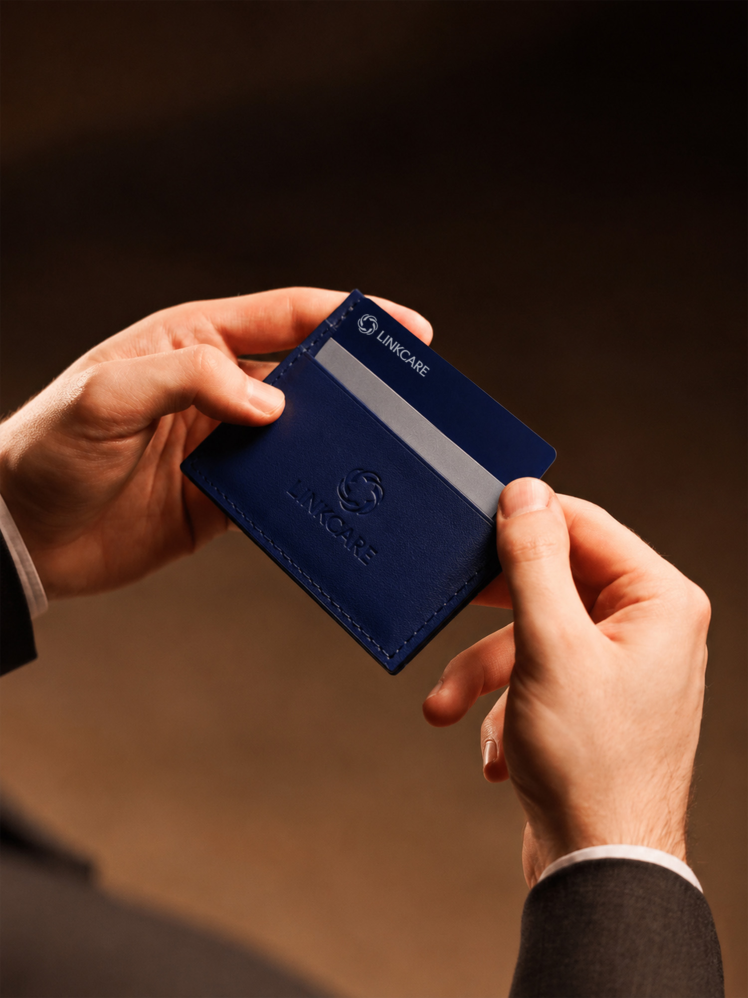
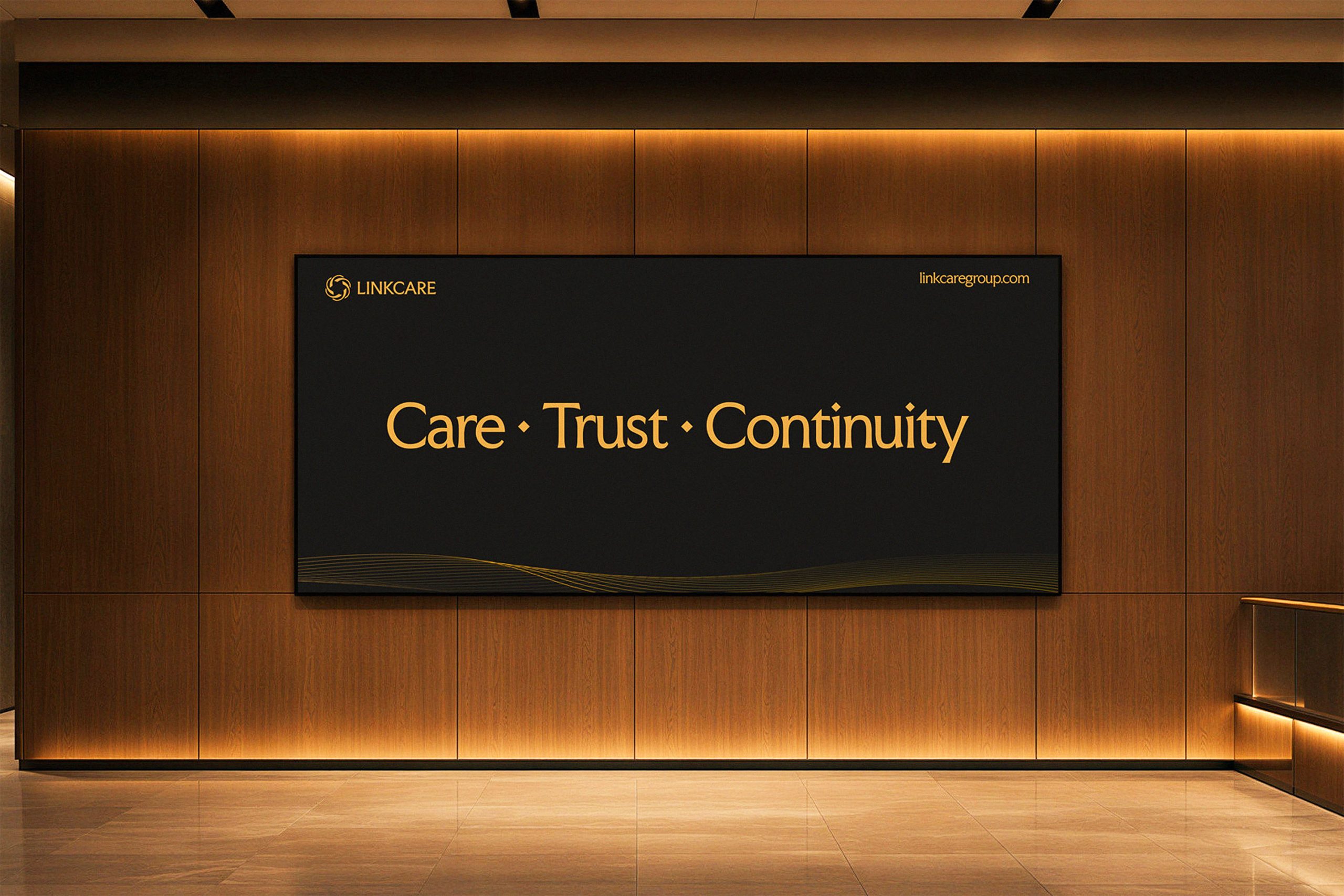
The system was rolled out across every operational level, from internal communications to partner and client engagements. Every touchpoint, from business cards and email signatures to commercial documents, runs on the same visual framework. Business cards use premium materials, a deep blue base, and foil-stamping details to create a polished impression in B2B meetings. The email signature system was standardized to maintain consistency across platforms and in every interaction.
LinkCare now presents itself to banks and corporate partners with the same discipline it applies to running its programs.











LinkCare
Connecting Privileges, Building Lasting Loyalty.

The Marinity
Where River and City Flow as One
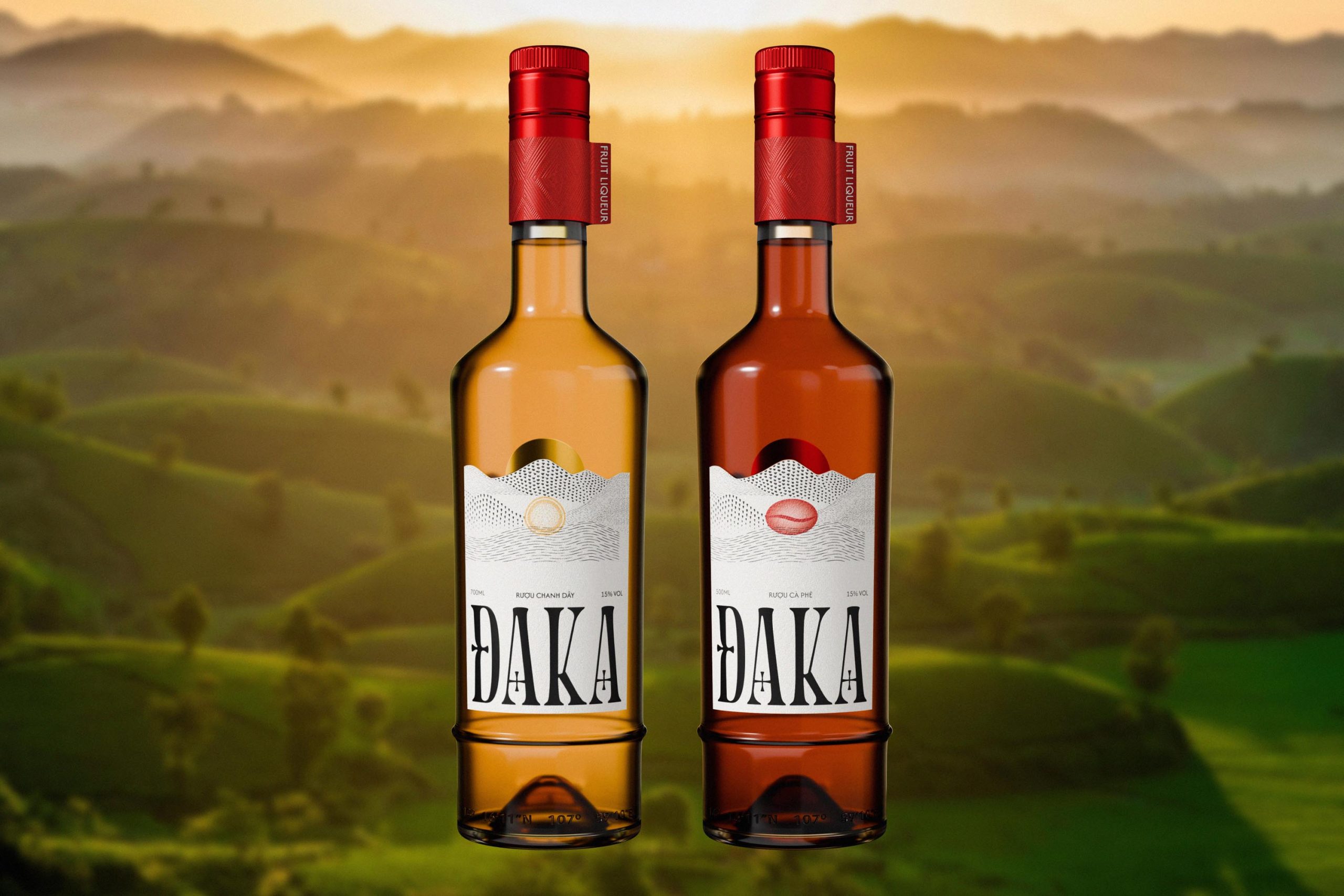
ĐAKA
Untamed Essence, Modernized Craft

Hy Tuoc Yen
Tinh túy đất trời

CL2B
Closed loop to balance